

The NHL unveiled all 31 new Adidas designed jerseys Tuesday night in Las Vegas. Some teams came out with new looks, while others stayed with their timeless, classic designs.
Needless to say, Adidas’ foray into the NHL has received a side-eye response from many. Despite never venturing far into the sport, Adidas was tapped with producing the league’s jerseys and merch for the foreseeable future. When you think about hockey you think of brands like CCM, Bauer, even Reebok, not… Adidas.
I’ve been very vocal about my stance on Adidas in the NHL. I don’t like it, and I’m not the only person to have that feeling. Given Adidas’ track record of committing atrocities with uniforms in college athletics, I don’t think I’m crazy to have that stance either. They just aren’t a hockey company.
I don’t love the new jersey construction at first sight, granted I obviously haven’t held one in my hand to feel yet. They just look stiff, cheap and boring from a glance. I’m skeptical of the whole thing, to say the least.
Anyways, let’s take a look at what each team did.
Chicago Blackhawks

First, with the team and historic design that we all care so deeply for. Reports right from jump street said that the Hawks weren’t going to make any changes, but I was still a little fearful. I wouldn’t have put it past Adidas to find a way to mess something up.
But I’m happy to report that the best uniform in the league stayed exactly the same.
My only issue is that the white collar on the red home jersey is WAY, and I mean WAY, too thick. I love how the away whites look, if I was to buy one of these it would be a white one. It’s weird because I actually kind of like the thick red collar on the whites. I’m sure all of it will grow on me eventually.
Vegas Golden Knights
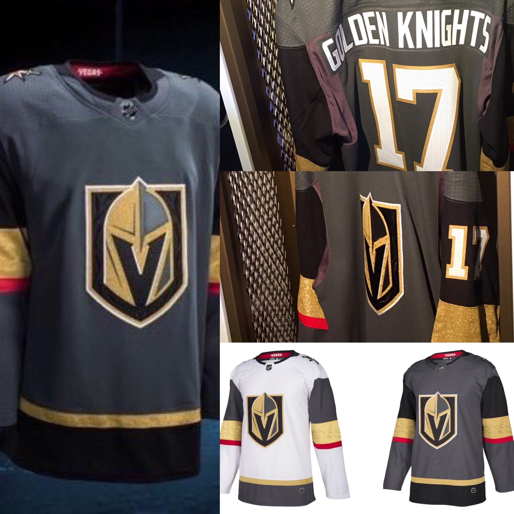
The next biggest question mark of the night surrounded the expansion team from Las Vegas. The Golden Knights unveiled their logo awhile ago, so no surprises there.
On first look I don’t really hate these all that much. I would have prefered if they had gone with black instead of gray, but I don’t hate it. The road whites are very clean, and I love the gold on the elbows. Overall solid.
We’ll see if the team that wears them on the ice comes close to being solid.
Minnesota Wild

A preview picture from a few weeks back suggested that the Wild were going to be making some changes with their home greens by adding a cream-colored mid-chest stripe, much like Montreal.
I didn’t like this very much at first, but honestly it’s growing on me. I like the new “M” shoulder patch that’s from the old home jersey logo. I don’t like the red collar tag, should have made that green or cream.
Pretty solid upgrade for the Wild. This just looks Minnesota to me.
St. Louis Blues

The only change the Blues made was going from yellow numbers to white numbers. I don’t understand why, but it’s the Blues so it figures that they’d mess something up.
Also, in a perfect world they should have gone with their 2017 Winter Classic powder blue jerseys. Oh well.
Nashville Predators

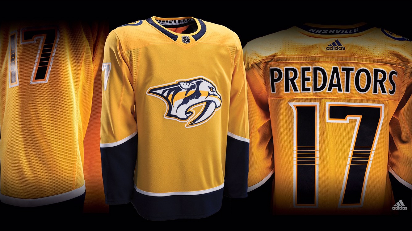
Yikes. Poor Nashville.
Just days removed from losing in the Cup Final, the NHL does them over again by stripping their totally unique look into something so boring and bland. After all the passion, culture and excitement we saw in the playoffs, they now have a jersey that is so not Nashville.
I hate how they took away the white piping. I’m ok with removing the navy blue on the back and front chest, but if you do that you have to keep that white piping or make it navy blue to break things up. The bottom lost some flair too.
Just an absolute downgrade for the Preds. That’s a dang shame.
Dallas Stars
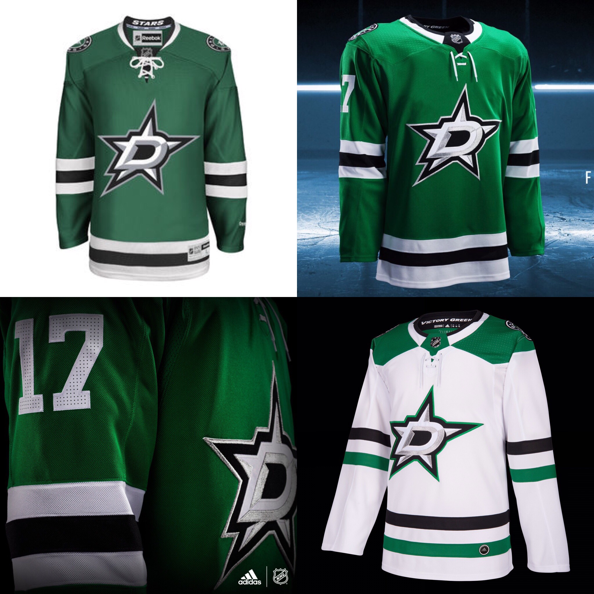
No change. Still love the green. Needs a Texas state flag shoulder patch though…
Winnipeg Jets

No change. Maybe a slight tweak on the numbers? I like the white collar tag on this one.
Colorado Avalanche

The Avs were due to freshen things up. They did that by going back to the template they had in the late 90’s and early 2000’s.
Many were wondering if the front crest would change, but it did not, and I’d glad it stayed the same. I love that logo. I also love that they chose to go back to the old template design. Also, new silver trim on the numbers. Still has the Colorado “C” on the shoulders too.
Upgrade for the Avs.
Los Angeles Kings
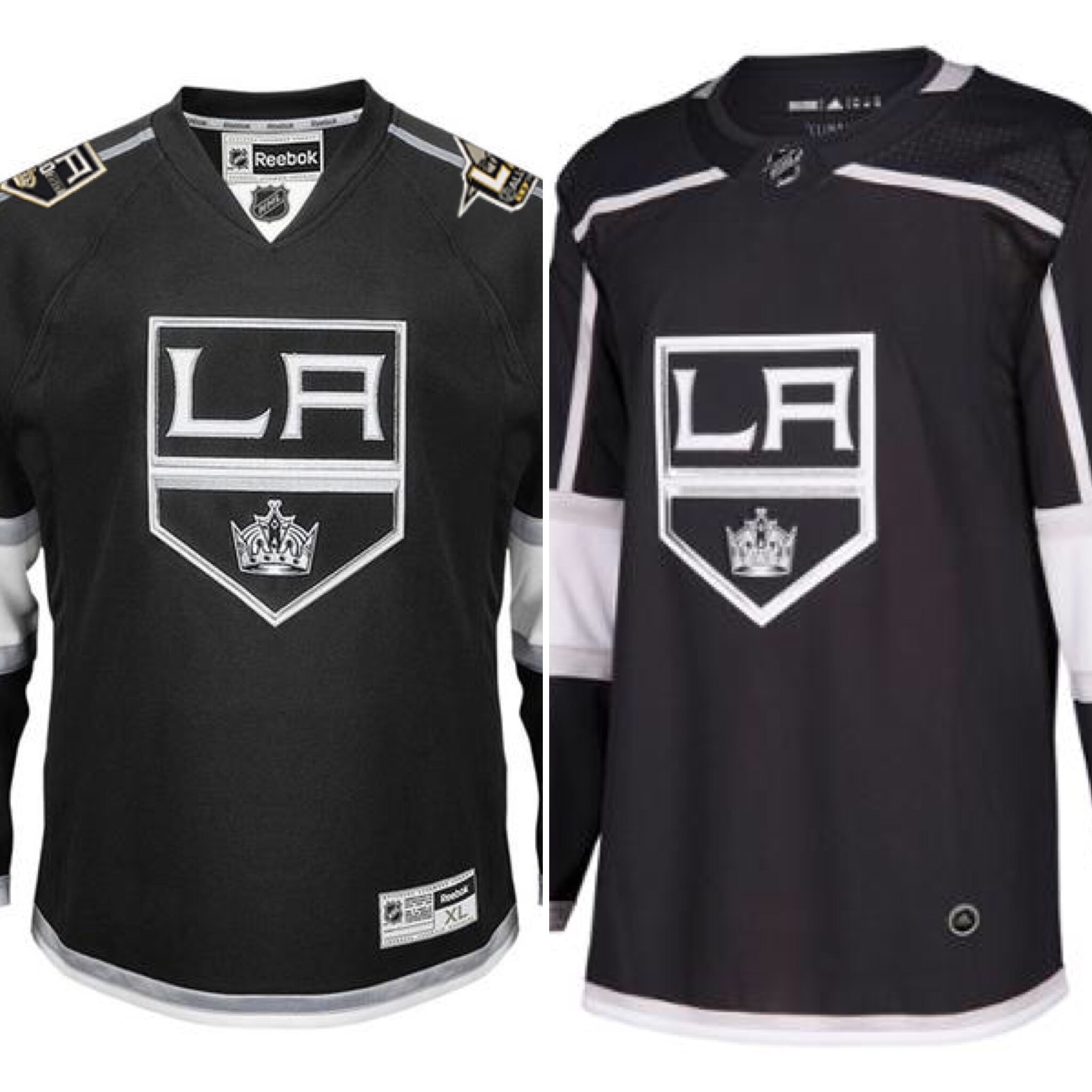
Same.
Anaheim Ducks

Same.
Arizona Coyotes

Same. (The black on their jerseys continues to grow on me. I like these a lot.)
San Jose Sharks

Same, except for a new shoulder patch on the teal home jerseys. “SJ” shoulder patch now on the away white. Love the teal collar on the away jerseys as well.
Calgary Flames

Mostly the same, and that’s real sad. The Flames need to go back to their 80’s throwbacks full-time. Those are absolute gems, and I hate that we can’t see them anymore because of the no alternates rule.
They removed some of the piping on the bottom and under the arms here. Just looks… simpler, a common theme here. Meh…
Vancouver Canucks
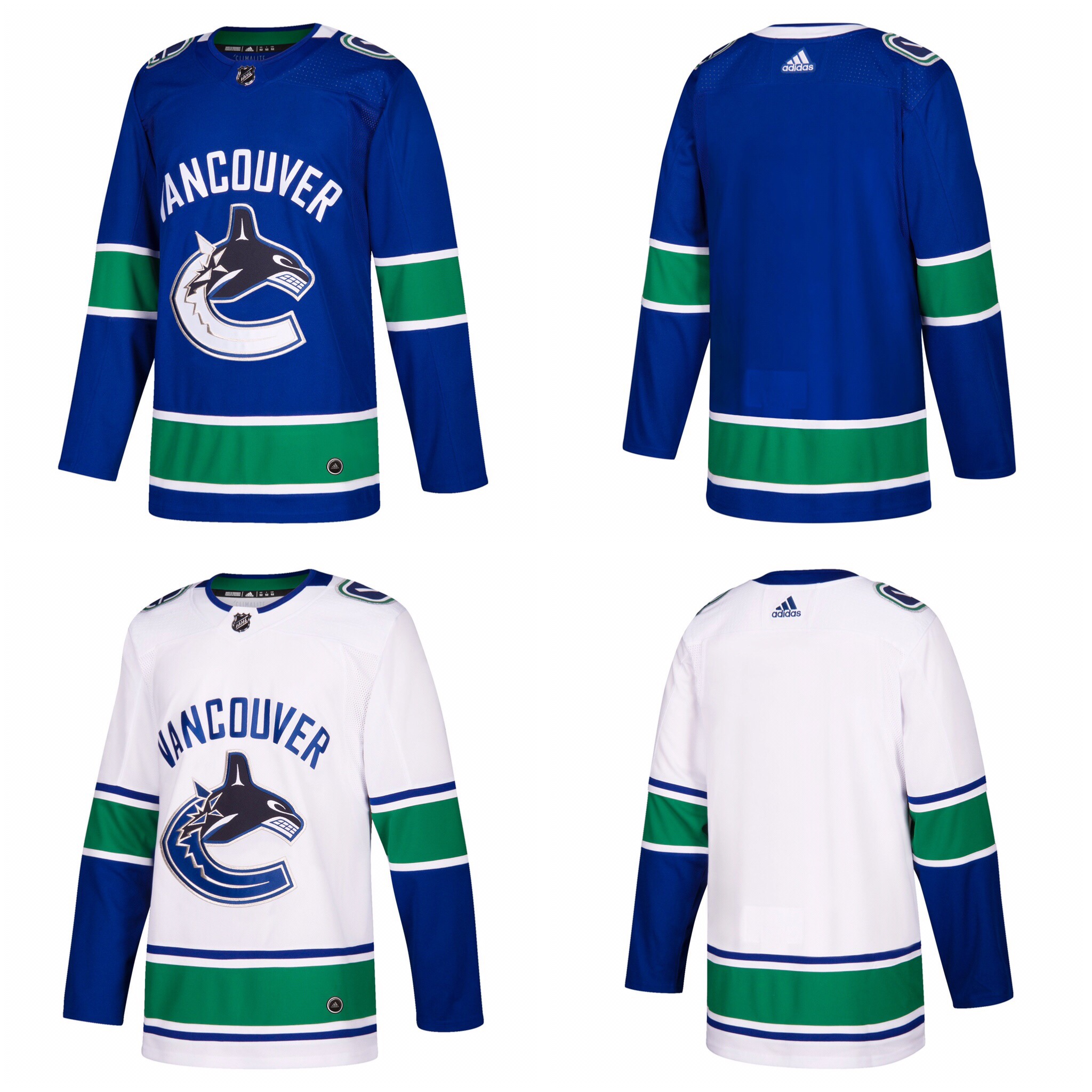
Basically the same. The only thing I notice is that the collar changes from front to back. I kind of like that. Would hate it if the Hawks did that, but it kinda works with their colors.
Edmonton Oilers

Hoo boy… OK.
First of all, the Oilers opting to not go with the retro blues in favor of wearing these Orange jerseys fulltime is an affront to God. I don’t know how you look at those old blues and don’t think they’re better than whatever orange dross is right here.
It’s horrible, and they even wore the blues the past few years and still chose to walk away! So bad. I hate them. The one noticeable change is that the names are white and numbers blue, and they went from a normal blue to a navy blue.
Montreal Canadiens
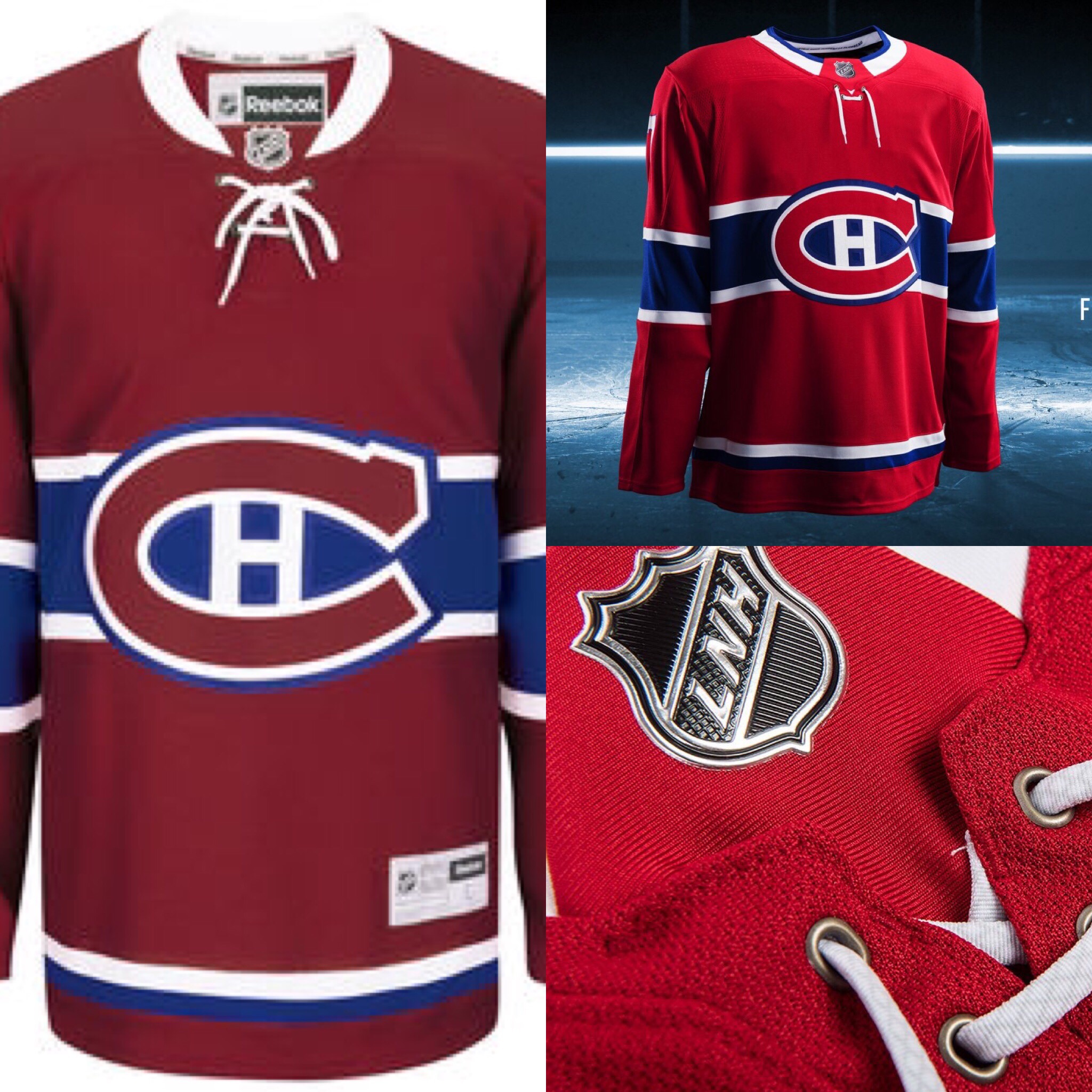
Same. Classic.
Detroit Red Wings

Same. Next.
Toronto Maple Leafs

Same. Moving on. (Love these, by the way)
Columbus Blue Jackets

Essentially the same look, but with a new edgy font for the name and number. Also a star is seen there on the wrist, a nice touch. These are good-looking. The new font is a major upgrade.
Buffalo Sabres
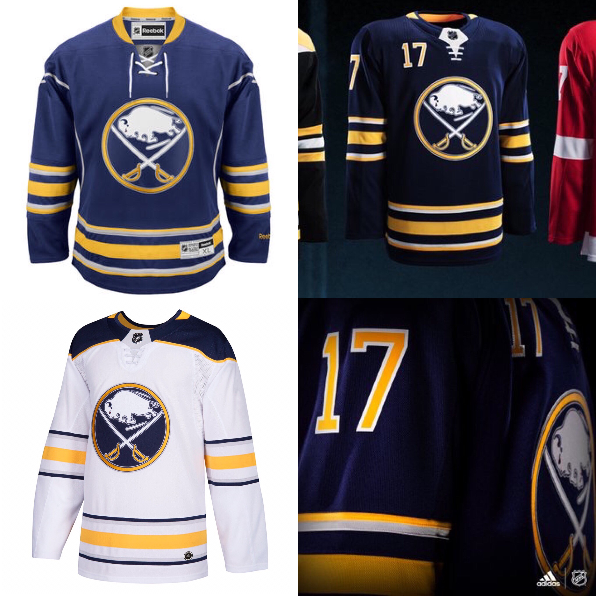
No change. Again, I hate the white collar tag. Sticks out too much. Make that navy.
Florida Panthers

No change.
But I just want to take a moment to brag on the Panthers’ scheme. I absolutely love their “new” look. I think it’s one of the best, most underrated, in the league. I love the Florida flag on the sleeve, the new crest, fonts, all of it. Only change I would make would be swapping the shoulder numbers and sleeve logos. GREAT look, Florida.
Tampa Bay Lightning
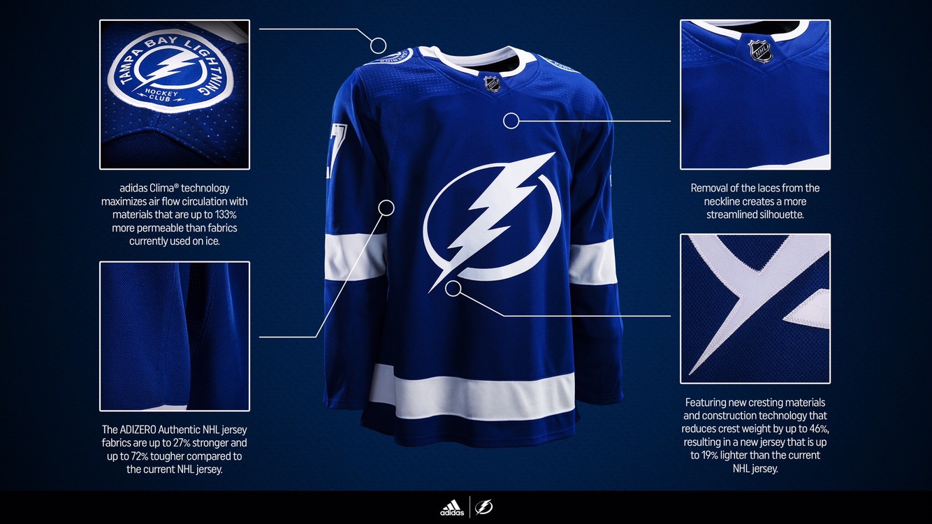
No change. Clean.
Ottawa Senators

These are AWESOME.
I love the new number and letter font. And that’s surprising because I was actually higher than most on their old numbers. Logo stays the same, more black under the arms, the white is still there too. The classic “O” shoulder patch remains intact. I love the look a lot.
**On second thought I HATE the black under the arms. Yuck.
Boston Bruins

Basically no change. The black has been taken out of the letters and numbers so now it’s just solid gold and white together. The letters and numbers kinda look slimmer to me, but that could be incorrect. Oh, and notice how they made the collar tag black so it blends in…
Great, timeless look.
Philadelphia Flyers
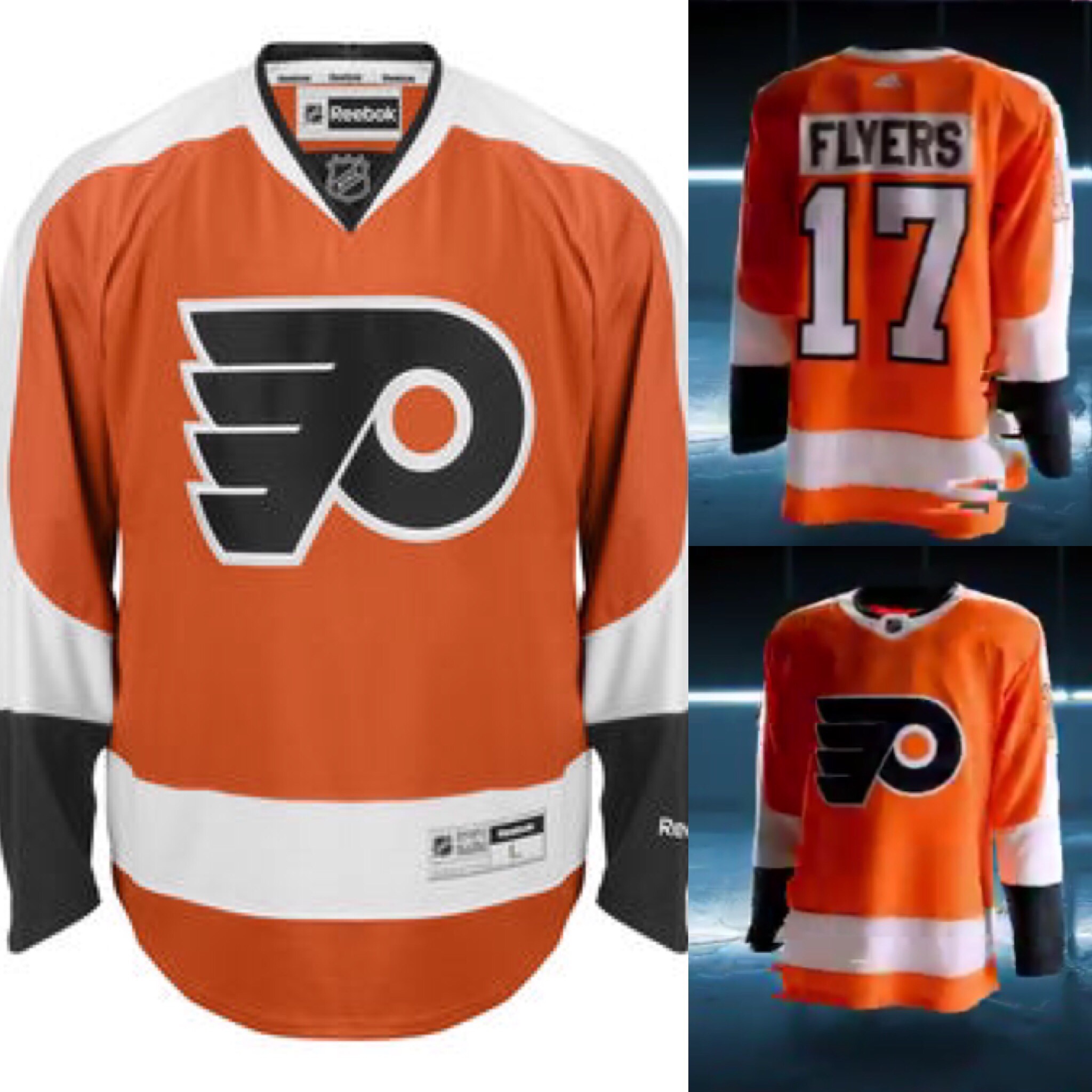
Same. Beautiful.
Pittsburgh Penguins.

Same. Stunning.
New York Rangers

Again, with these dang collar tags… Just make that mug blue! Also don’t like the red collar on the away white, it should be blue. Anyways, basically the same classic look for the blueshirts.
New York Islanders
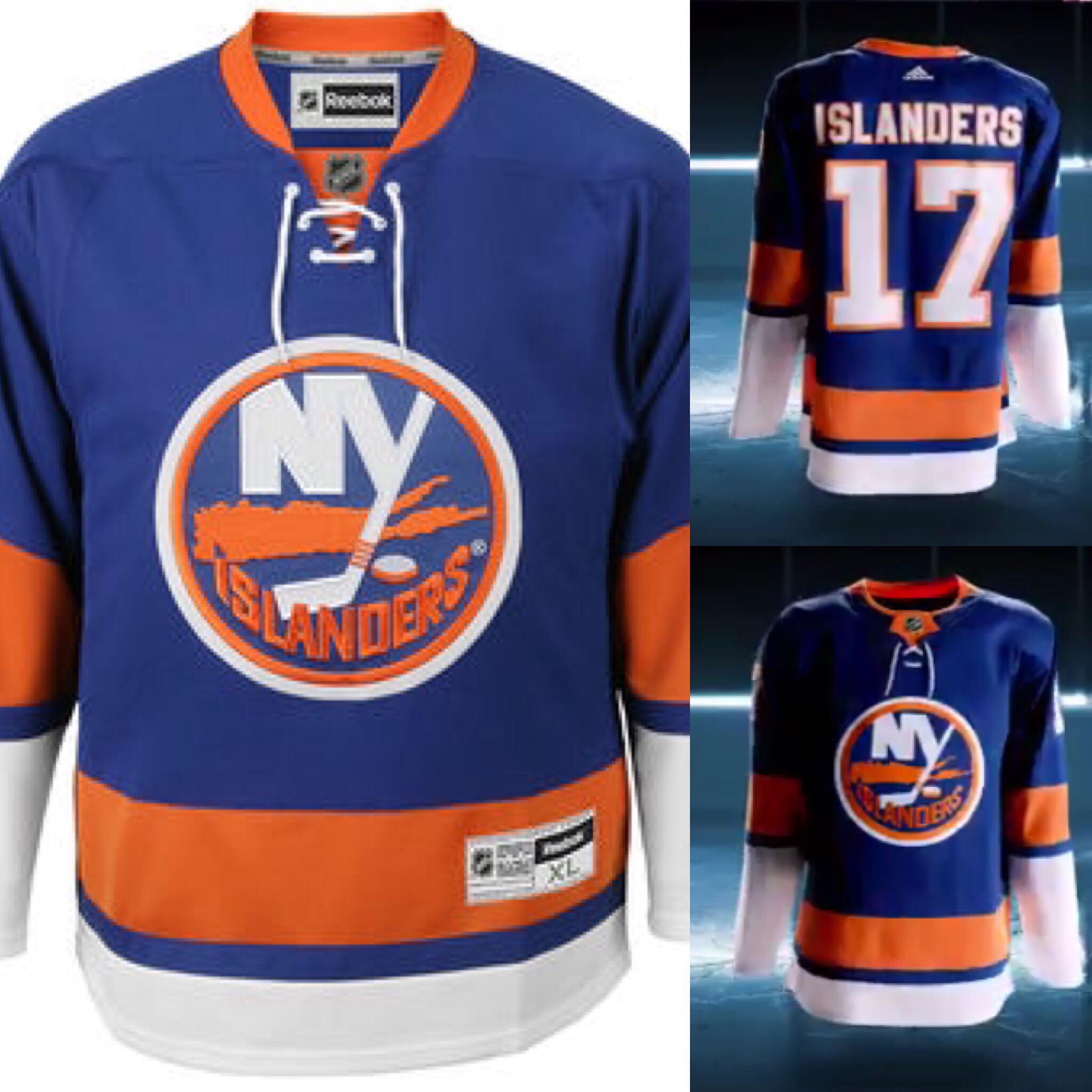
Same. Gorgeous.
New Jersey Devils

Pretty much the same. Not sure I’m too hot about the thicker stripes. The old three stripe on the bottom are now gone, replaced by that thinner one. Not sure I like that.
One cool feature is their three Stanley Cup winning years on the inside collar, colored in green to symbolize the Devils’ old red and green look. Should go back to that. Classic!
Carolina Hurricanes
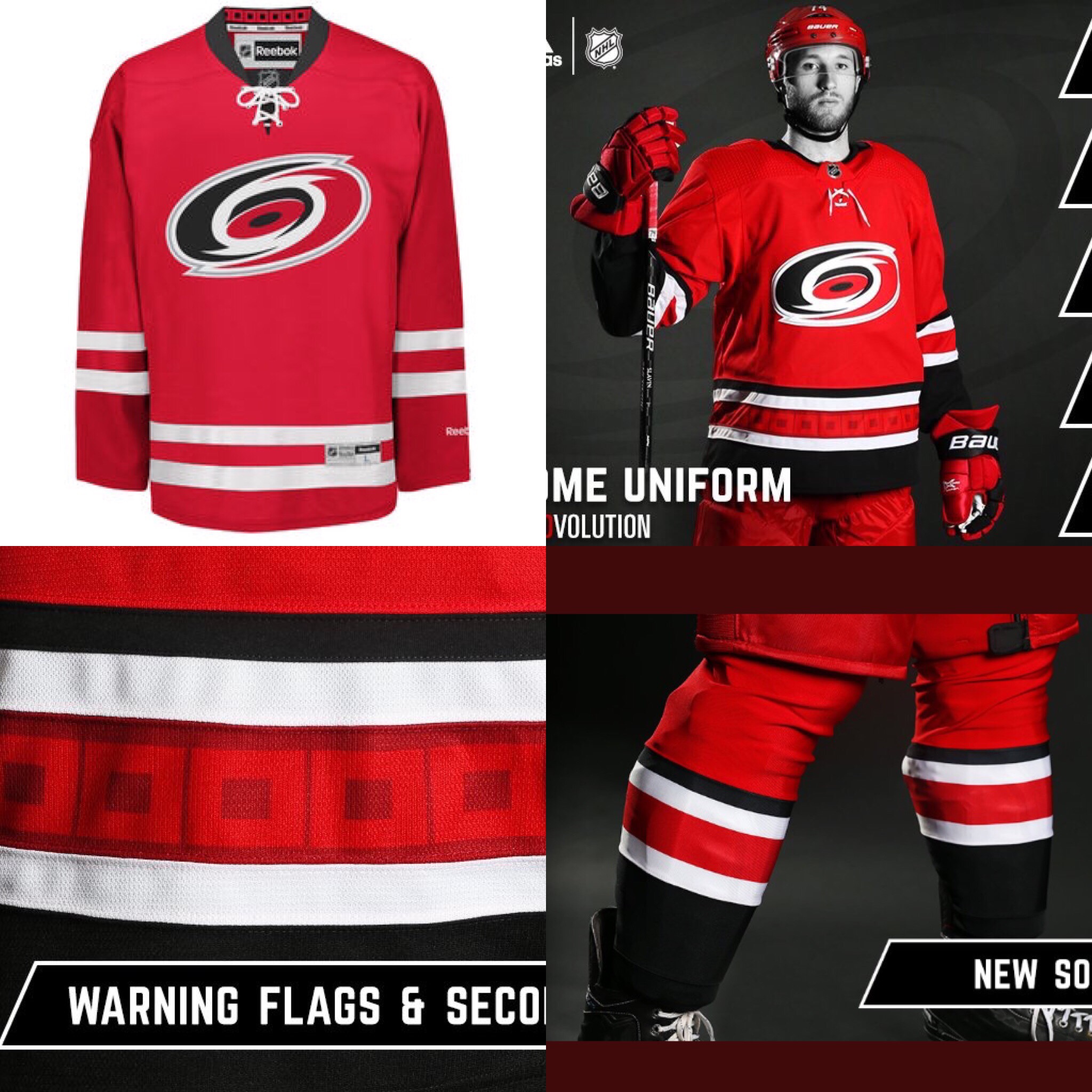
The Canes might win the most improved award. They’ve brought back the heavy black accents that they abandoned a few years back. Honestly, the all red look terribly boring, and brought zero uniqueness or creativity to the table.
Here they’ve brought back some of that edge. They added things while staying simple. You don’t have to be boring to have a clean, simple jersey design.
Huge upgrade for the Canes here. These jerseys will look great in the playoffs, or in Hartford.
Washington Capitals
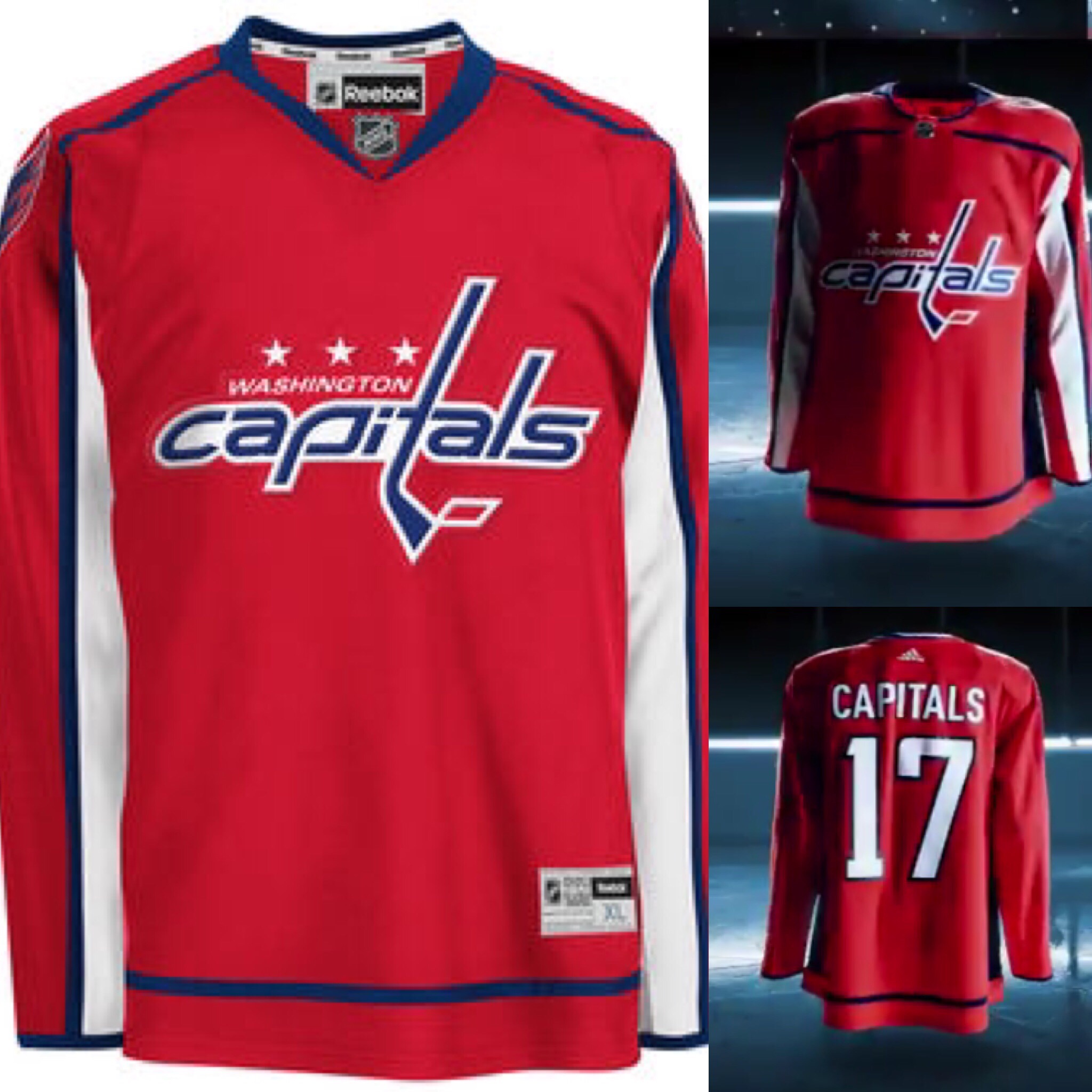
No change. Boo.
Should go fulltime with the throwbacks (could say that about so many teams).

I’m surprised you like the Sens’ jersey. Pretty much every Sens fan HATES it (’cause they wanted the heritage “O”).
LikeLiked by 1 person
I think the fonts were an improvement. Also, personally would for them to go back to original Senator head logo over the current one. Heritage “O” is a classic so I understand the want to use that one
LikeLike
Adidas (la-de-da) fucked up the Hawks home jersey with that stupid looking, retarded looking white collar……………….The NHL signs an agreement with A-di-das and the teams don’t have any say so?………………you mean the Hawks management/players went along with that moronic pilgrim-looking collar being added??? Way to fuck up a classic you fucking morons; you fucking bastards…………………………..Hope your fucking company tanks.
LikeLike